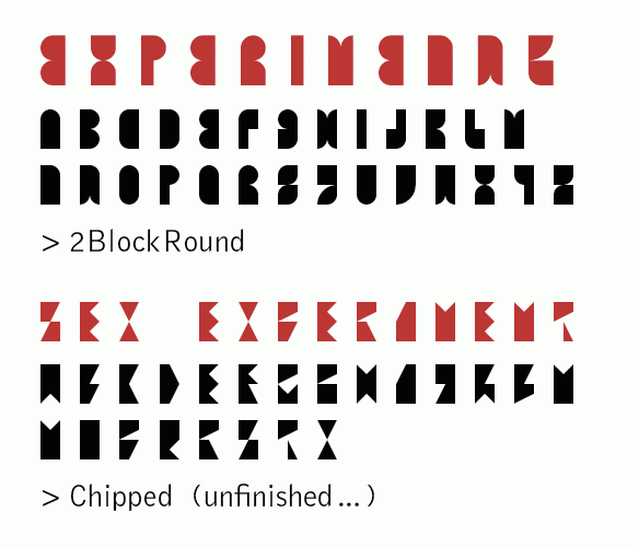
Always searching for less, one is bound to hit the bottom. In my quest for ever smaller grids I tried some experimental fonts. And ended up with mucho experiment and little font. Anyway, here is the outcome of my little escapade.
I set out to make an alfabet using only two blocks per character. Now there are some funny bricks in FontStruct that can add some directions or detail, but wanting to keep some visual coherence in each font, narrowed down the choice. And soon after starting, I decided it would have to be stencil fonts. That means no isolated inner shapes. Also, stencil fonts would justify a certain unavoidable roughness.
I like 2BlockRound for some of its lettershapes, but had you read EXPERIMENT at first glance? Not everyone does go along with the E being the mirror image of the B, and the T and G are very far cousins, if part of the family at all… Some words would work, others are to be typeset at own peril.
Chipped took off from the same idea, but using only the square and hooky bricks. I guess you read the first three letter word at glance, but maybe because it was already between your ears… Anyway, B could be an alternate for F, C for K, R and P come dangerously close and some characters were almost impossible to render. Abandoned before the alfabet was round.
Insider was a promising idea: to work only with the inside space of a character. Using suggestion: very avantgarde and smart. Pitty it doesn’t work. Pretty intriguing forms though. This is where text stops and code starts. Might return to this one day…
Hammerhead started with the lowercase, where it got it’s name. I made some characters combining round and hooky elements in each. Ugly and clumsy, but with a touch of street credibility that reminded me of handcut letters in adhesive foil that I might have seen on a food stand in a place where tourist are rare. I like it but I wouldn’t kiss it with my eyes open. Keeping the same flavour in the caps was less easy. I like the R, but that sounds like saying to someone: ‘I like your left nostril a lot!’
One funny caps-only letter came last. Quarterback uses only half bricks and three quarter bricks (or straight corners if you like). I started with a four block x-height, which proved not enough for the B, E, Q, S and Y. So I cheated and went below the baseline, making titles look like a clothes line. There must be some use for this. Window dressing? Mosaic lettering? You tell me.


